color, fabric
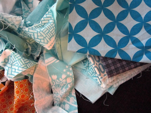
If you had this waiting for you on your kitchen table, wouldn't you be eager to get out of bed? I was! I literally woke up this morning and thought, QUILT!

Last night I pulled strip scraps for two quilts I"ll be making for a friend. I'm excited because they're going to be easy quilts and each twin-sized, so I'm counting on them to put a good dent in my overflowing strip scrap bins. I tend to use strips the least for sure.

Both quilts are to be full of neutrals - brown, black, gray and white - with some colors thrown in to suite each child. For the girl's quilt we settled on peachy pinks and limey greens. I added in a dark fuschia pink and a dark green with lime accents to add some dark, contrasting values.
The boy quilt is neutrals plus orange and aqua. My friend was digging the dark orange prints. Wish I had more! Aqua I have a plenty, but the only darker tone I could find to mix with the aqua was this prized Cathedrals scrap from Anna Maria Horner's Good Folks collection. I'll use it, but I really want more dark blues in that color. And this isn't the first time I've picked through my (too large) stack of blues in hopes of finding something that matches that particular print. I just can never find anything. The closest Kona color is actually Kona Turquoise, but the Good Folks print has just a touch more of green. It's like a vibrant dark turquoise? If you happen to know of a simple, modern fabric that features that color, do let me know!

I spent the morning cutting and then began combing the websites of my fabric store sponsors (shameless plug - buttons at right!) for fabrics to match that Cathedrals print. And because I never order just one thing, I also was on the lookout for dark orange, any oranges (I go through orange and yellow like water), lemon yellow and mostly black prints. Oh yes, and I do need more light gray and fuschia as well... You know how it goes. (But, really, I need these colors!)
I found a lot of goodies at Lark Cottons, including the Anna Maria pastry voiles in marine and magenta on sale for $9 a yard. Ever since finishing my Loop de doo skirt in the saffron pastry voile, I've been thinking I'd like to buy up the pastry voile in other colors for future skirts and tops. The colors are so vibrant, so "me"!
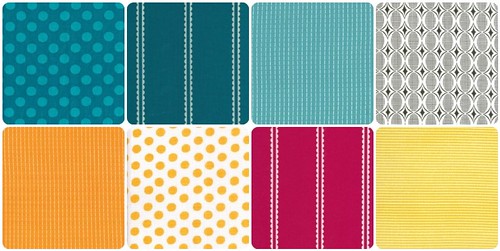
So, from top left that's Ta Dot in Teal, Pastry Voile in Marine, Running Stitch in Turquoise, Half Moon Ovals and on the next line Running Stitch in Creamsicle, Spot Taffy, Pastry Voile in Magenta and Punctuation Stripe in Yellow. The only one I'm hesitating with is the Punctuation stripe. Does anyone who has owned it know if it's more of a lemon yellow or golden yellow? A golden yellow is more orange and a lemon yellow is more cool, clear, pure. Somehow I only ever buy golden yellows. It's a problem.
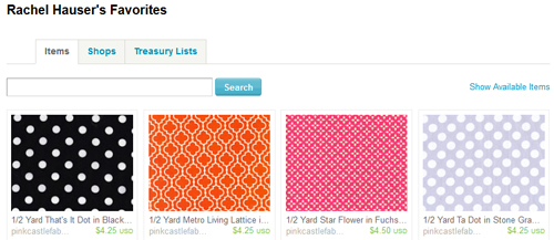
And because I was covering all my bases, I also ended up with a cart at Pink Castle Fabrics (on Etsy and here). More great basics to keep me in color.
So, I guess this is the story about how my quilt that is partially designed to help me use strip scraps also brought on a fabric shopping spree? I trust you fully understand.
P.S. For those of you who wonder, I buy 1/2 yards in most anything I buy. I will buy 1.5 yard cuts of the pastry voiles, just since I'll be making clothes with them. When it comes to making quilt backs, sometimes I buy new yardage and other times I just piece together what I have. That's my system! I rarely buy fat quarters since they tend to be too limiting for binding, backing, etc.

Last night I pulled strip scraps for two quilts I"ll be making for a friend. I'm excited because they're going to be easy quilts and each twin-sized, so I'm counting on them to put a good dent in my overflowing strip scrap bins. I tend to use strips the least for sure.

Both quilts are to be full of neutrals - brown, black, gray and white - with some colors thrown in to suite each child. For the girl's quilt we settled on peachy pinks and limey greens. I added in a dark fuschia pink and a dark green with lime accents to add some dark, contrasting values.
The boy quilt is neutrals plus orange and aqua. My friend was digging the dark orange prints. Wish I had more! Aqua I have a plenty, but the only darker tone I could find to mix with the aqua was this prized Cathedrals scrap from Anna Maria Horner's Good Folks collection. I'll use it, but I really want more dark blues in that color. And this isn't the first time I've picked through my (too large) stack of blues in hopes of finding something that matches that particular print. I just can never find anything. The closest Kona color is actually Kona Turquoise, but the Good Folks print has just a touch more of green. It's like a vibrant dark turquoise? If you happen to know of a simple, modern fabric that features that color, do let me know!

I spent the morning cutting and then began combing the websites of my fabric store sponsors (shameless plug - buttons at right!) for fabrics to match that Cathedrals print. And because I never order just one thing, I also was on the lookout for dark orange, any oranges (I go through orange and yellow like water), lemon yellow and mostly black prints. Oh yes, and I do need more light gray and fuschia as well... You know how it goes. (But, really, I need these colors!)
I found a lot of goodies at Lark Cottons, including the Anna Maria pastry voiles in marine and magenta on sale for $9 a yard. Ever since finishing my Loop de doo skirt in the saffron pastry voile, I've been thinking I'd like to buy up the pastry voile in other colors for future skirts and tops. The colors are so vibrant, so "me"!
So, from top left that's Ta Dot in Teal, Pastry Voile in Marine, Running Stitch in Turquoise, Half Moon Ovals and on the next line Running Stitch in Creamsicle, Spot Taffy, Pastry Voile in Magenta and Punctuation Stripe in Yellow. The only one I'm hesitating with is the Punctuation stripe. Does anyone who has owned it know if it's more of a lemon yellow or golden yellow? A golden yellow is more orange and a lemon yellow is more cool, clear, pure. Somehow I only ever buy golden yellows. It's a problem.
And because I was covering all my bases, I also ended up with a cart at Pink Castle Fabrics (on Etsy and here). More great basics to keep me in color.
So, I guess this is the story about how my quilt that is partially designed to help me use strip scraps also brought on a fabric shopping spree? I trust you fully understand.
P.S. For those of you who wonder, I buy 1/2 yards in most anything I buy. I will buy 1.5 yard cuts of the pastry voiles, just since I'll be making clothes with them. When it comes to making quilt backs, sometimes I buy new yardage and other times I just piece together what I have. That's my system! I rarely buy fat quarters since they tend to be too limiting for binding, backing, etc.

