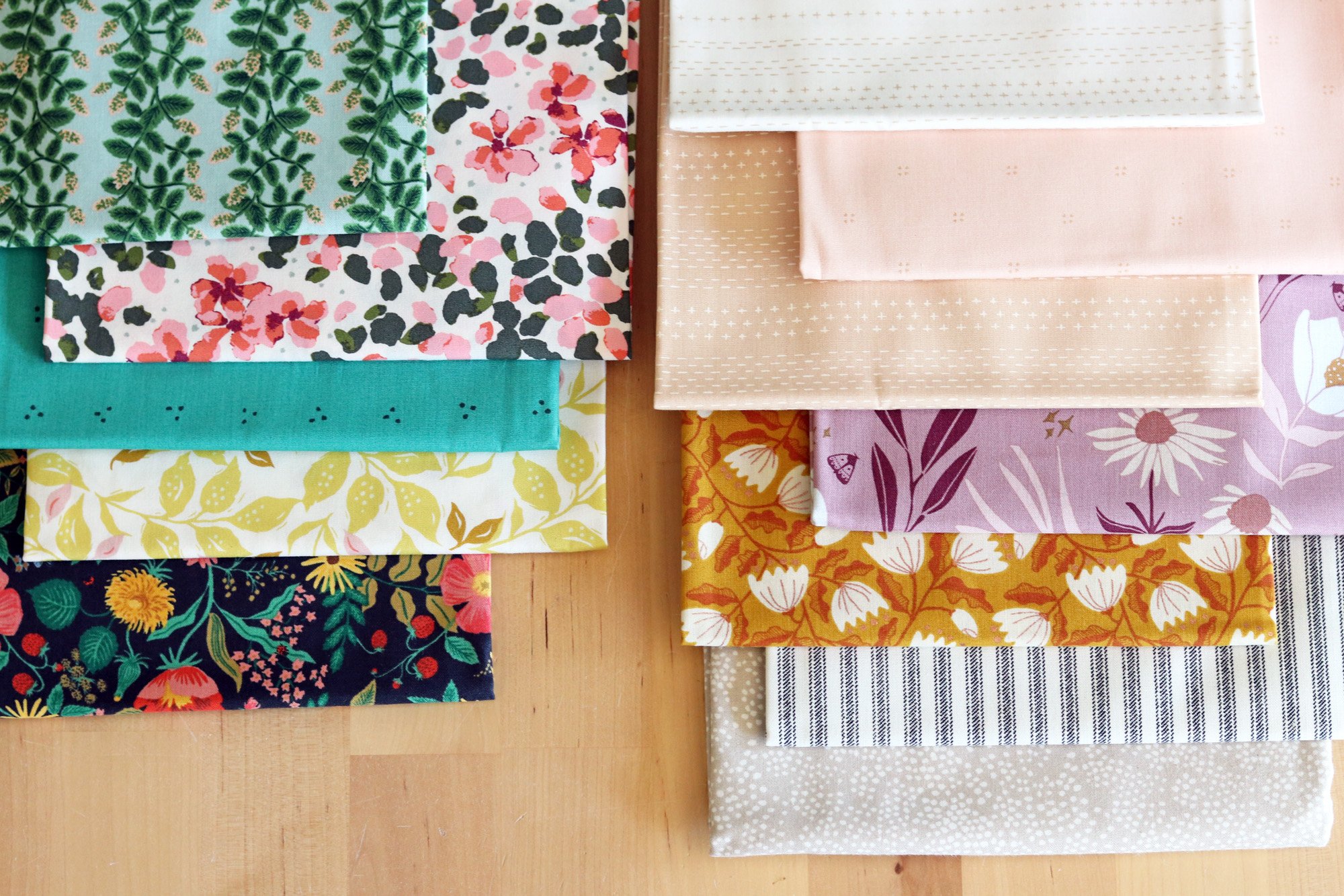
the Colors I Need
Guess what? In a month’s time I am flying to the states for Aria’s wedding! Of course I don’t want to miss this opportunity to freshen up my fabric stash. I will be placing orders soon with my favorite American shops, but before I start browsing and falling I love with every random thing, I want to think strategically.
When I first got into quilting I bought fabrics on impulse, but nowadays I am a more careful fabric shopper. I make stash additions 4-5 times a year. It might be because a specific fabric collection has caught my fancy or because I need a lot of yardage for a particular project. Other times I shop for basics like low volume fabrics and one-color prints that will play well with many different projects. With basics I often buy 1/2 yard cuts, picking and choosing the colors that really speak to me, rather than buying a whole collection.
Lately I have noticed that certain colors are not well-represented in my fabric stash. I feel then like a painter without paint. Only, unlike a painter, I can’t mix different colors to create the desired hue! So today I have poked around in my scrap bins to find scraps of the colors I need. After all, scraps are often remnants of your most useful fabrics - the ones you keep reaching for or have almost entirely used up.
First, the cool colors. These are the shades I would especially like to find when I go fabric shopping. Let’s take a closer look - - -
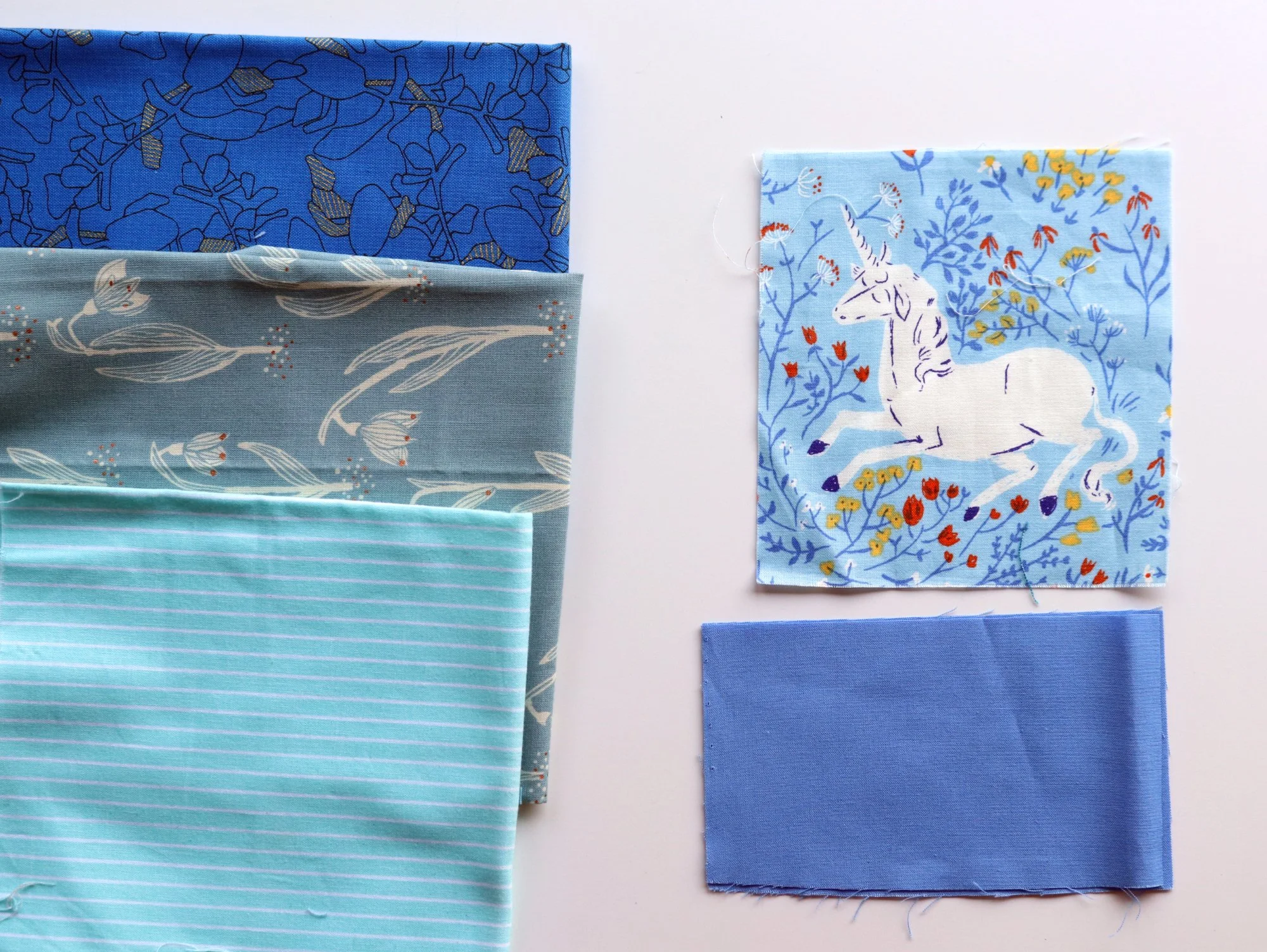
I always need true blues, like the scraps on the right. I have photographed the scraps with some stash fabrics to define what I don’t want. I don’t need more saturated cobalt blues, dusty country blues or blues tinted aqua. Instead, I want soft, pure, true blues that are medium saturated. I seem to have trouble finding this shade in modern style fabrics, but Heather Ross and Allison Glass might be good sources.
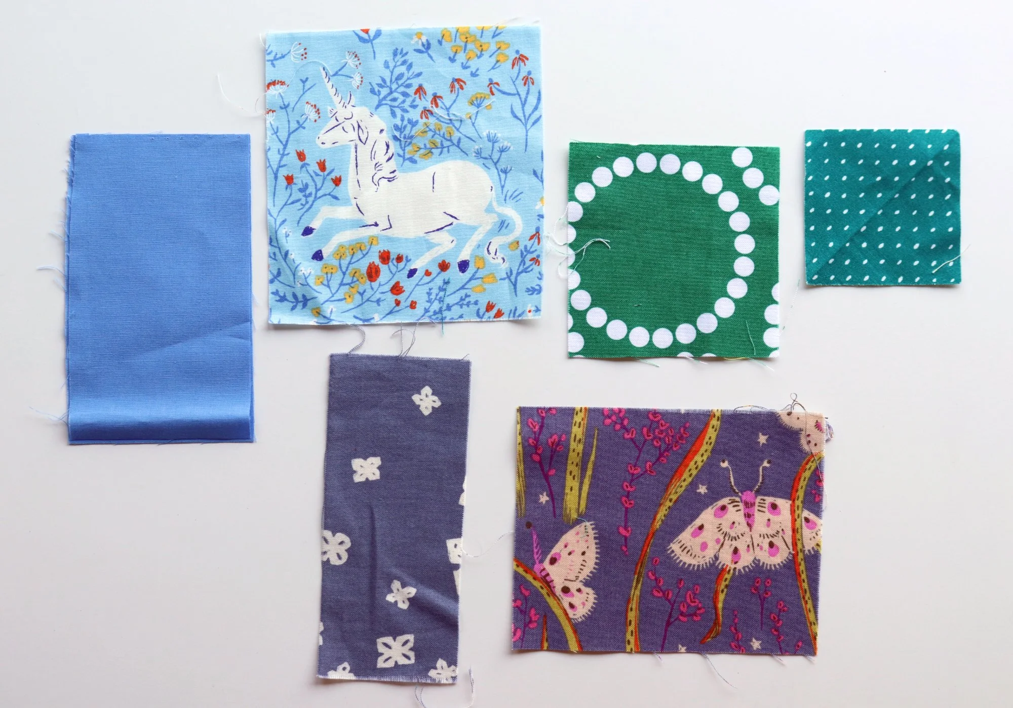
And while we’re talking about blues, I would absolutely love to find some periwinkle blues like these scraps. Particularly that top right one! That shade of blue-gray-purple has looked good in sooooo many patchwork projects. It’s a winner. And this purple-blue moth print is another unusual sort of purple that I’d love to have in a basic. Once again the stash fabrics shown define the “wrong” shades for my shopping trip: gray (without blue or purple tints), a periwinkle with too many secondary colors or a plummy purple.
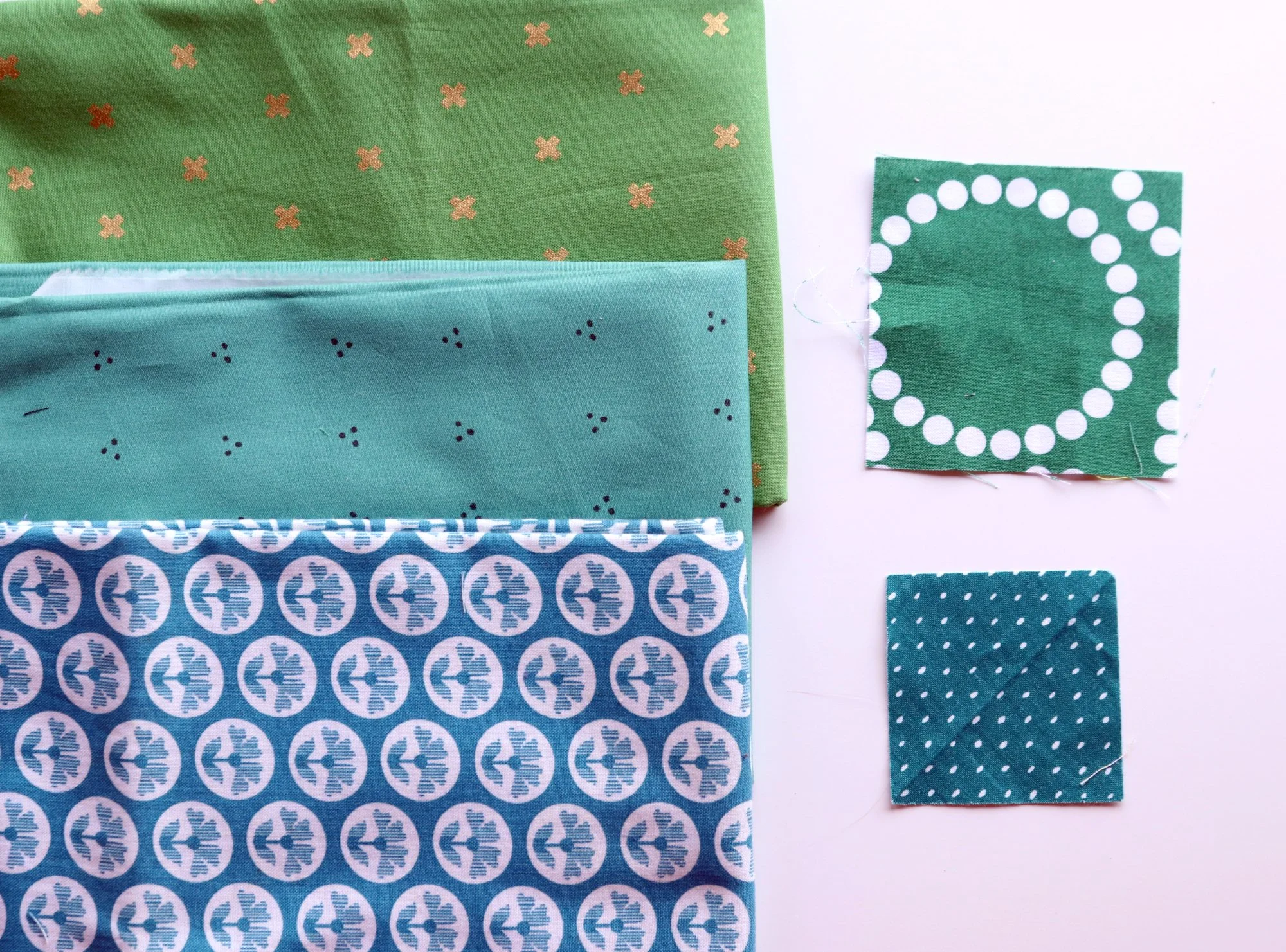
To be honest I can’t get enough of green in any and every shade. I LOVE green and go through it like water. That said, I would particularly like to find that kale green shade from the pearl bracelet print and a dark, rich teel like that square scrap. In this case I’m not looking for a true green, a medium jade or a dark teal that has lot sof blue in it, like the floral shown here.
Sponsor of the Week
Tales of Cloth
Jodi’s new Monet quilt launches today! Choose between the PDF pattern alone or the 3 in 1 bundle (PDF, papers, acrylic template) and enjoy the easy journey through various patchwork techniques.
For the next 2 days, enjoy a special launch discount - 15% off any Monet product automatically!


Let’s not neglect the warm colors! If you’ve been watching this space in the last years, you won’t be surprised that I need to restock peach fabrics. I keep putting it with everything, haha. So, more peaches would be great. What about the other hues?

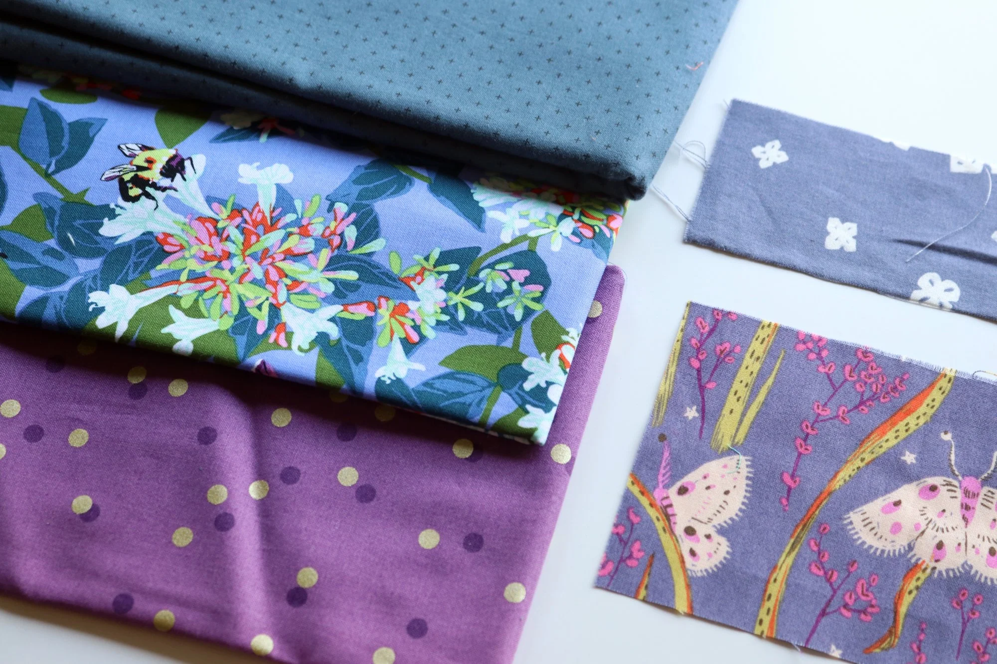
This long strip scrap represents my ideal shade of burgundy. I don’t want a plum color, a magenta or a dark red, as represented by the stash fabrics. I have a project in mind for my new bedroom that will need burgundy and wine-colored fabrics, of which I have almost none. This shade is a must for my shopping trip!
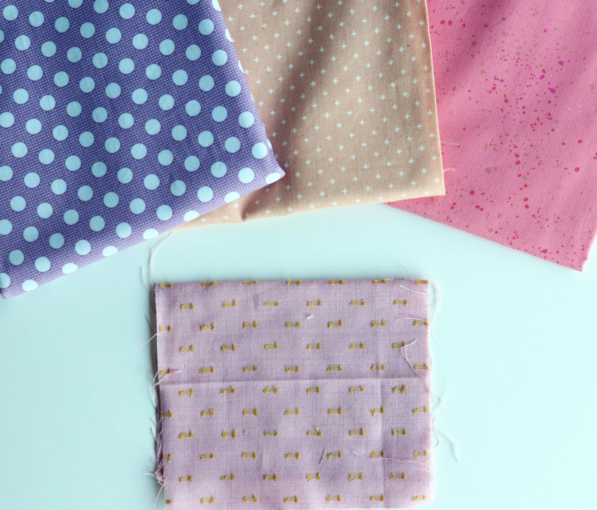
Another rare color in modern fabrics is this light mauve. It’s not purple or peach or pink. Light mauve sits in between a rose blush and a soft violet. It has a restful, feminine vibe. I’d like it to use it in my bedroom quilt as well. Fingers crossed.

And last but not least is this peculiar olive color. It’s kind of green, but kind of yellow and kind of brown too. I have photographed it with these stash fabrics to try to show the contrast. I guess I’d call it a yellowy olive shade. I like it in combination with pinks, reds and blues, and would be happy to experiment further with the color.

When I do my fabric shopping, all of which will be online, I will be mainly searching for colors. Still, that doesn’t preclude other themes. I would like to increase the number of tonal stripes in my stash and would be happy to find some funky, medium-scale checks like these shown. A good stripe and/or check can really up the cool factor in patchwork. They are a good foil to all the floral prints that we tend to love.
Okay, now I feel ready. I have been responsible and thoughtful and now it’s time for some fun! Here we go a-shopping!